Section Title
Grids and layout
The Interface design language is inspired by the geometry of our products, building on a system of grids. Influenced by Swiss design, the relationship between typography and grids is fundamental in informing the layout of our creative approach.
The Bug

Our approach to layout is inspired by the Bug and our modular product tiles.
Building the grid
In this section you will find guidance on how to create a range of grid types to be used across various formats. Although social content and digital advertising will be the most common applications, the same basic rational will apply to any creative execution.
The Bug Matrix
Begin by creating a square grid, known as the Bug Matrix. Content panels, informed by the square and rectangular shapes present in the Bug, can be used within this grid to create image and type containers.
While the individual grid units are not perfectly square, the grid will provide the closest representation of the Bug.
The ratio and dimensions of the format will dictate the design of the grid. Margin sizes will also scale up or down based on how the format will be viewed.
16:9 Version

When creating content typically viewed on larger devices with a 16:9 screen ratio, we’d suggest using the 16:9 version of the Bug Matrix. This could include film or animation-based content, content for desktop viewing, or PowerPoint presentations.
This type of matrix uses a 41x22 grid structure.
9:16 Version

When creating social content specifically for Instagram stories, the 16:9 version of the Bug Matrix may be rotated 90°.
4:5 Version

When creating social content in general, we’d suggest leading with the 4:5 ratio, maximising screen real estate on devices with smaller screens. This format uses a 22x28 grid structure.
1:1 Version

When creating social content that demands a square format, use the purest version of the Bug Matrix as a simple 22x22 grid structure.
Using the Bug Matrix
The simplicity of the Bug Matrix allows for a wide range of layouts, with different possible type and image combinations. Image panels should always sit on the grid. Care should be given to finding an appropriate relationship of scale when using more than one panel. For example, with the Made for More brand campaign, there may be visual executions that require a lead campaign image and detail image in the same grid. Typography should either hang from a grid point or align from a margin where possible.
Flexibility of the grid
When creating visual content using the Bug Matrix, it’s crucial that you consider the audience, the viewing format, and most importantly what role the content has.
For hero, brand or product campaign-level content, we’d suggest having a single, lead image. This will allow the creative to have as much visual real estate as possible, within the chosen format. Imagery should either fill a single panel or fill the format entirely.
For more in-depth content, multiple image panels are a great way to illustrate process or to hero specific features – whilst creating visual hierarchy. Panels can overlap to create more of a mood board look, helping to integrate type with imagery and align with specific campaign creative direction.
Usage – Experiential design
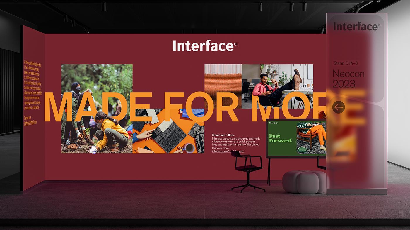
The Bug Matrix really comes to life when used at larger scales, in applications such as tradeshows or exhibitions. In this instance, multiple pieces of content can be arranged and given different hierarchies within a single wall or surface.
Headlines and images can start to have a stronger visual relationship, and the flexibility of the grid allows for the merging and connecting of imagery with typography, using cut-outs.
Usage – Print adverts
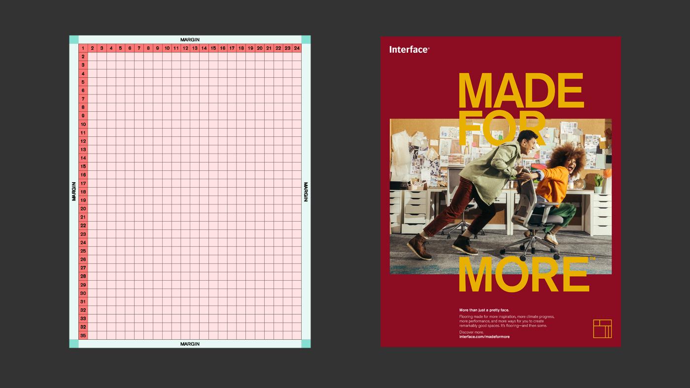
Using portrait format as a guide, we’d suggest using a 24x35 grid structure.