Section Title
Typography
Good typography helps an audience not only navigate but understand complex written information. Great typography does this while conveying a brands personality and values. Our brand typefaces have been selected because of their design flexibility, as well as their simple elegance.

Akzidenz-Grotesk Pro
Our primary brand typeface for all communications is Akzidenz-Grotesk Pro. This choice of typeface has been selected to strike a balance between simple elegance, neutrality and consistent legibility. It is available in a range of weights, making it ideal for all our communications.
Due to licensing restrictions, font files cannot be circulated. Licensing requires a purchase to be made per design workstation. If internal or external resources require access to font files, contact your regional marketing team.


Type basics
Tracking
Tracking refers to uniformly increasing or decreasing the horizontal spacing between a range of characters. Careful application of tracking will improve the overall legibility of a block of copy.
Letter spacing should be tightened slightly to create maximum legibility (e.g. -20 in Adobe InDesign)
Letter spacing that is too wide is hard to follow.
Letter spacing that is tightened too much compromises the integrity of the letterforms and is difficult to read.
Leading
Leading refers to the space between adjacent lines of type. Careful application of leading will improve the overall legibility of a block of copy.

If in doubt, use the 20% rule. For example typography that is 20pt should have 24pt leading in print. Screen use leading may require wider leading.

Overly wide leading is hard to follow and compromises any sense of hierarchy within the text.

If in doubt, use the 20% rule. For example typography that is 20pt should have 24pt leading in print.
Hierarchy
Hierarchy refers to the approach of organising information into tiers to help guide the reader into the material, as well as signalling the importance of certain pieces of information.

Hierarchy can be created using a number of different tools, from weight and spacing, to size and color, but use these tricks with consideration. Ensure the hierarchy rules set for a particular document, format or campaign are followed consistantly.

Text without hierarchy becomes difficult to follow and offers no point of entry for the reader.

Using more that one or two visual tricks on each tier or using them inconsistently can result in a confusing and distracting hierarchy.
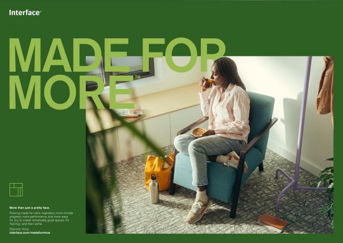
Akzidenz-Grotesk Pro in action
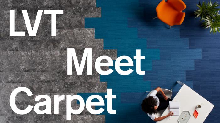
Akzidenz-Grotesk Pro is an extremely flexible typeface.
It can both express energy, through more dynamic compositions, as well as communicating simple, functional elegance.

System alternative

Arial
Most electronic devices do not include Akzidenz-Grotesk Pro by default. The Arial font family is available on all standard Mac and PC systems and may be used as an alternative to maintain our visual identity when our primary typeface is unavailable.
Arial is a system font and should only be used as an alternative if Akzidenz-Grotesk Pro is unavailable.
Powerpoint
When using powerpoint consider if the file may be opened on a device that does not have Akzidenz-Grotesk Pro installed. Fonts are not embedded within Powerpoint and any use of Akzidenz-Grotesk could result in the font defaulting. To avoid this, Arial should be used as the system alternative.
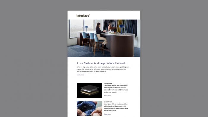
Email templates
Akzidenz-Grotesk Pro may not render as intended within email software. When creating email templates, Arial should be used as the system alternative.

Non-Latin Font Alternatives
If you need to install these fonts please contact your local IT department.