Section Title
The Bug
A graphic element seen across Interface assets is the icon we’ve dubbed “The Bug.” This icon is a nod toward our geometric, modular flooring products, and is inspired by the dimensions of our hallmark square tiles and planks. It acts as a brand icon, supporting product-focused messaging, and creates a recognizable visual element that can be used in functional and creative ways.
Always adhere to the following guidelines to ensure effective application of the Bug, across all our communications.
The Bug
Minimum size

Print version
The minimum width of The Bug is 12mm.

Digital version
The minimum width of The Bug is 40px.
Clear zone

Maintaining visual integrity
The Bug must be positioned free from any visual interference. To ensure this, a clear zone equal to 1/3 the total height of the Bug must always be maintained on all four sides. These size and orientation guidelines help maintain the clarity and visual integrity of the icon.
Color variants
The Bug icon is used in black, white, grey or any of the brand colors from our secondary palette.


Correct usage
The Bug can either sit over photography or solid color.
The Bug should either be aligned to the margin of the format, or another graphic element. Ensure there is sufficient clear space between the Bug and any other graphic element.
Avoid placing the Bug over visually complex images. Ensure there is a minimum level of contrast between the Bug and the background.
The shape of the image panel can be used to determine a clear space for the Bug.
Incorrect usage

Do not alter the orientation of the Bug.

Do not stretch or compress the Bug.

Do not skew the Bug

Do not add drop shadows.

Do not use colors or tints with insufficient contrast.

Do not use off-brand colors.
Brand Pattern
Two patterns have been created, each for a different purpose. Both patterns are a visual representation of the modular flexibility within the Interface squares + planks system. We use them in limited situations as special treatments; they are not intended for heavy use.
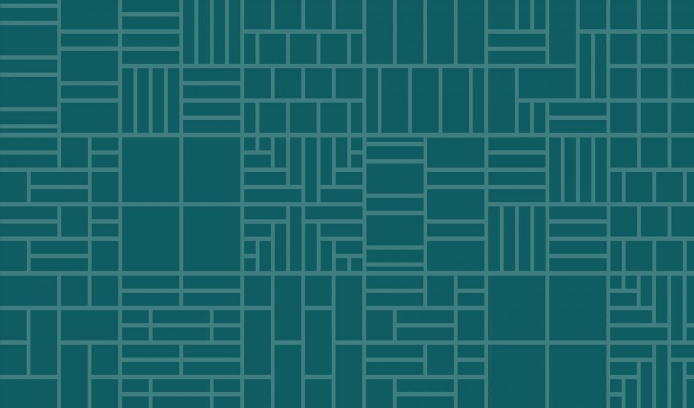
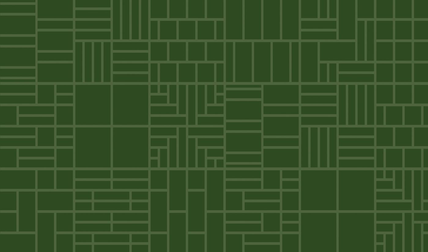
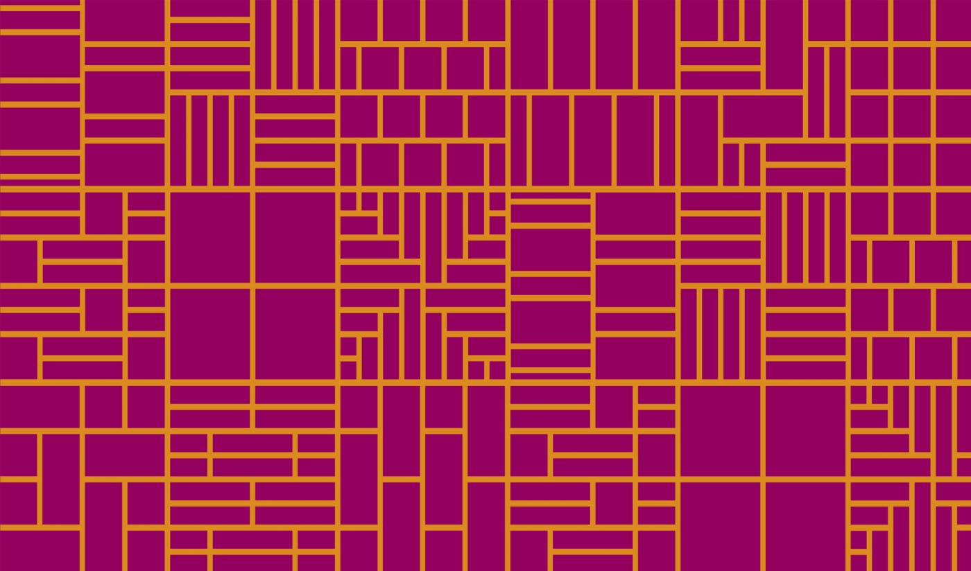
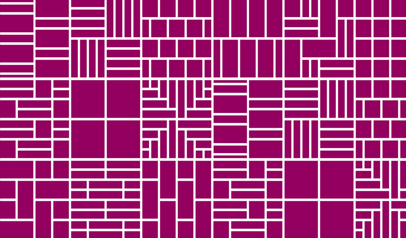
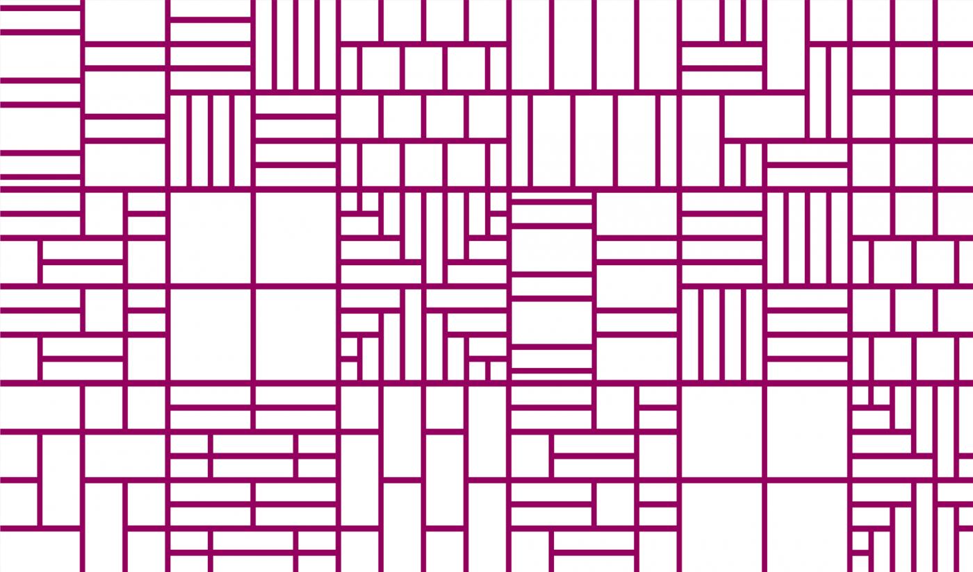
Modular Pattern
The modular pattern is built from the "The Bug" icon which features tile shapes and sizes offered within the Global Interface system.

Applications
Application examples for the modular pattern include, frosted glass windows, shelf & trellis systems, gray on white graphic wallpaper for large entryway walls and wall coverings. The moduar pattern is not intended for covers of brochures, signage or standard design materials. If you have questions on where this may be applicable other than what is demonstrated here, please contact the Creative Team.
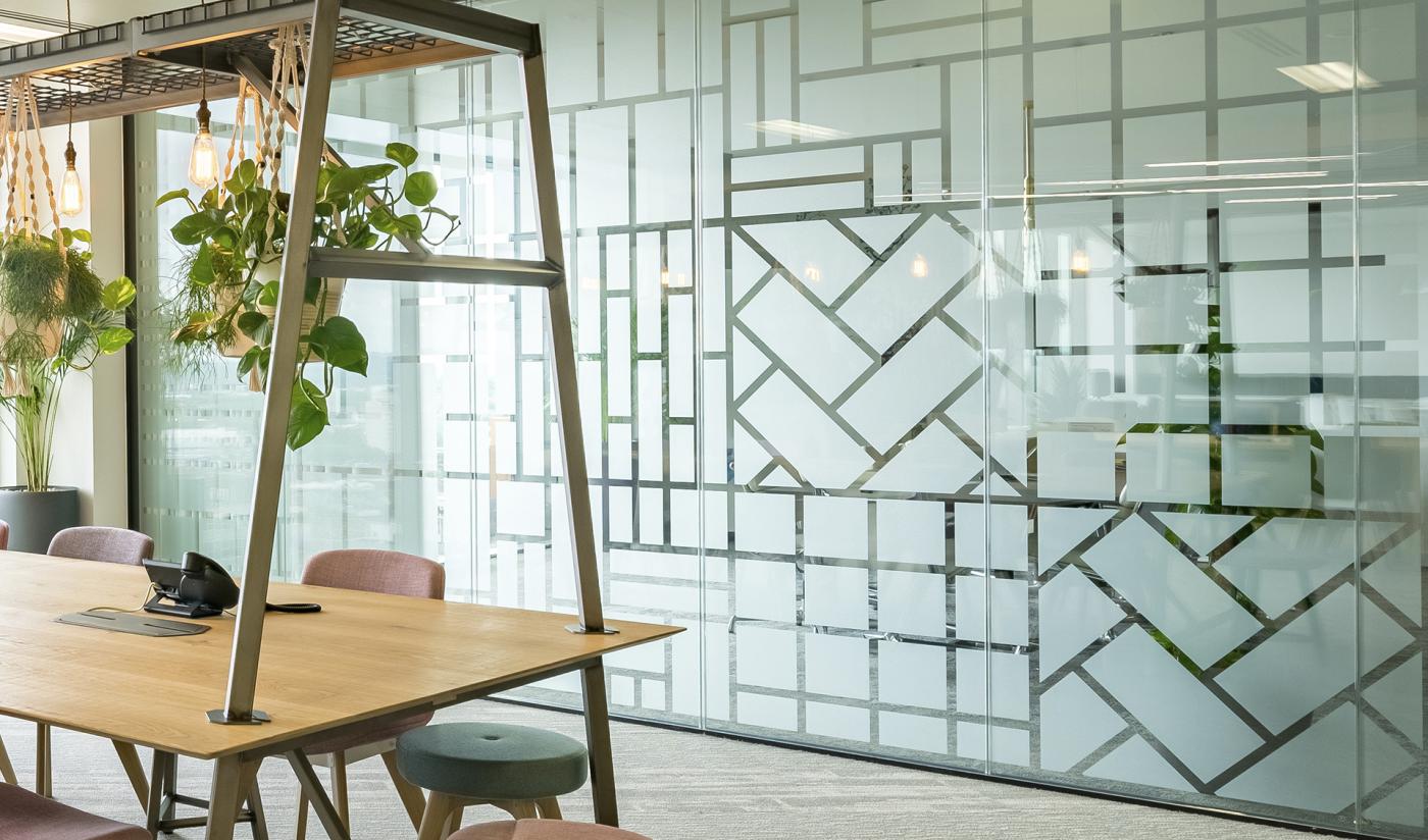
Frosted window graphic

Textured wall covering
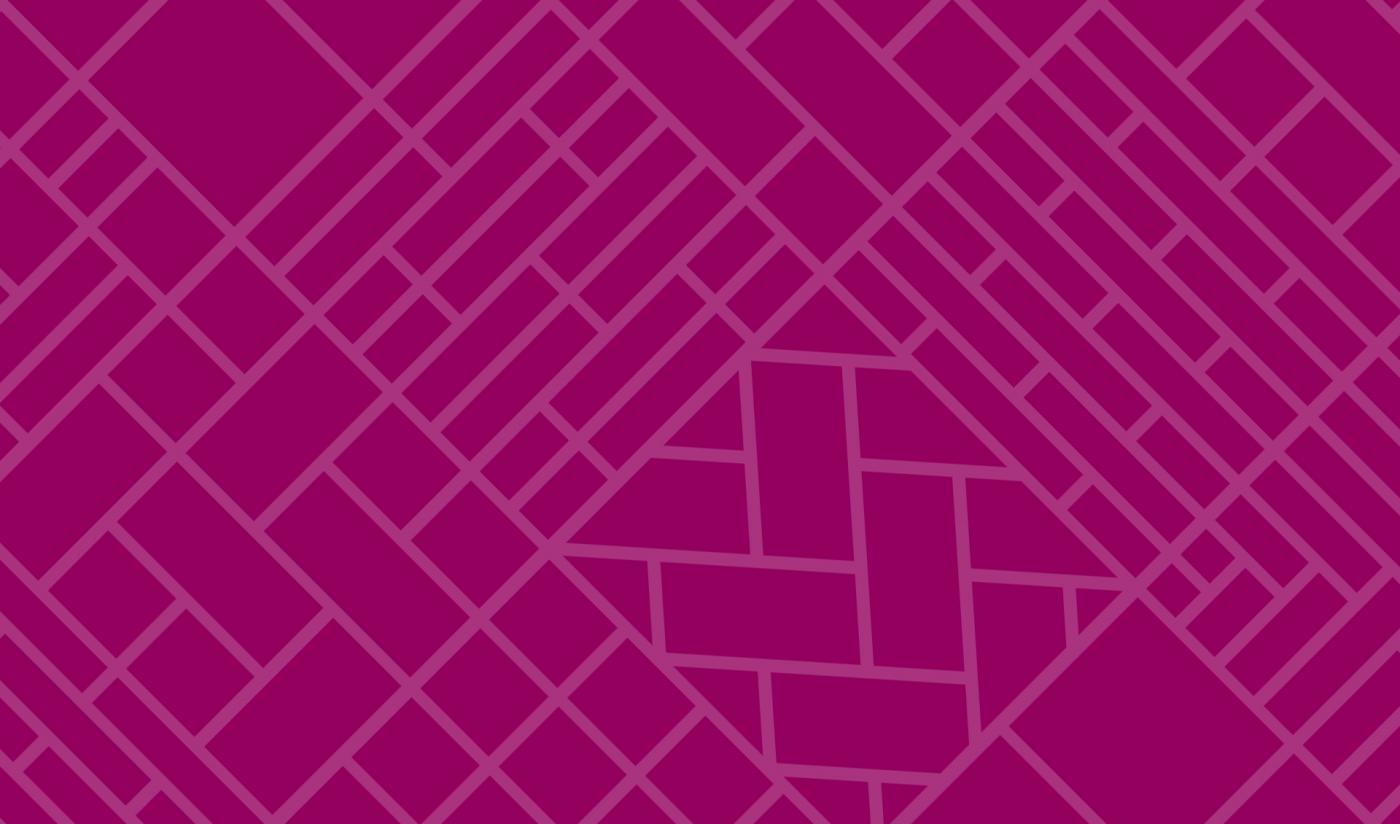
Mash-up Pattern
Built from the installation icon set, this pattern demonstrates the endless possibilities that can be designed using the Interface squares + planks systems.

Applications
The Mash-Up pattern should only use the Interface colour palette. The contrast between lines and solid shapes or background and shapes should be subtle; a 10% to 20% screen difference is ideal to achieve desired contrast. Application examples include the back of business cards, global campaign materials, inside liner of folders or bags and event space accent wallpaper.
Correct Usage
Incorrect Usage
Do not use multiple colors for background and line work
Do not make the lines white on top of a color background
Do not make the pattern a linear color
Do not rotate the pattern