Section Title
Interface logo
Our logo is the visual embodiment of our brand Interface®, or our endorsed brand nora® by Interface®. The correct presentation of our name is critical in building and maintaining its value. It is a reflection of the trust our combined customers have in us to be consistent, reliable and innovative.
When referring to our company as a whole we use the Interface Logo. For more information on using our endorsed brand nora® by Interface, head to the nora® by Interface® section.
Logo
The Interface® Logo always includes the registered trademark symbol except in signage.
Minimum size
Print version
The minimum width of the Logo is 20.3 mm.
Digital version
The minimum width of the Logo is 110px.
Clear zone
Maintaining visual integrity
The Interface Logo must be positioned free from any visual interference. To ensure this, a clear zone equal to the height of the lower case ‘e’ must always be maintained on all four sides. These size and orientation guidelines help maintain the clarity and visual integrity of the logo.
Color variants
Usage on photography

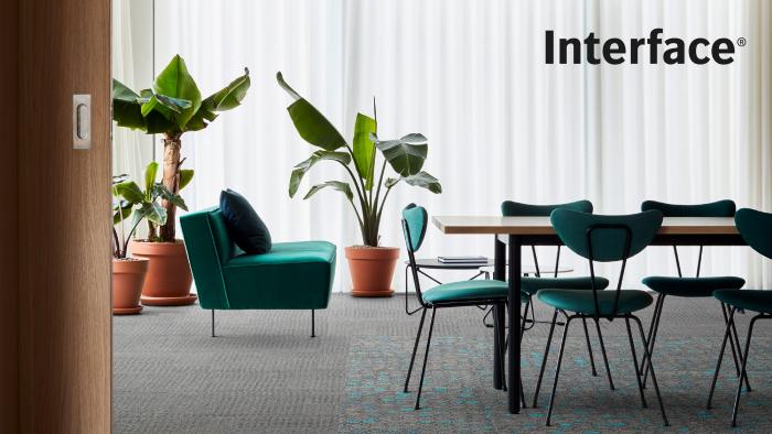
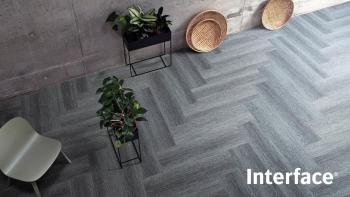
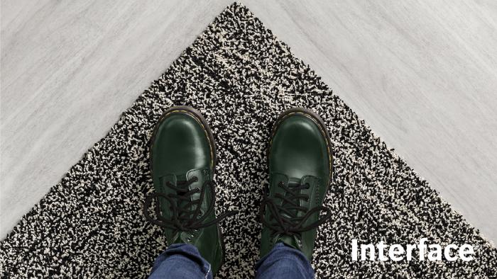
Always place the Logo over clear, simple areas of photography.

Ensure there is sufficient contrast with photography.

Avoid placing the Logo on areas of color that do not provide sufficient contrast.

Avoid complex or busy areas of photography that compromise the integrity of the Logo.
Correct usage
Horizontal
Where possible, present the Logo horizontally. Do not edit or compromise the Logo asset in any way.
Vertical
When placing the Logo vertically, ensure that the Logo is read downwards rather than upward.
Incorrect usage
Do not stretch or compress the Logo.
Do not skew the Logo.
Do not use off-brand colors.
Do not add drop shadows.
Do not use colors or tints with insufficient contrast.
Do not create a pattern with the Logo.
